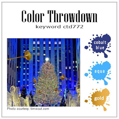
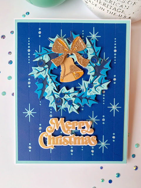
This week at the Color Throwdown, Amy Rysavy chose soft colors that remind me of visions of sugar plums and gumdrops, but the prettiest winter bouquets, too…blue, peach, and green…
I used The Greetery’s “Winterberry Bouquet” for my card…
This week at the Color Throwdown, Amy Rysavy chose soft colors that remind me of visions of sugar plums and gumdrops, but the prettiest winter bouquets, too…blue, peach, and green…
I used The Greetery’s “Winterberry Bouquet” for my card…
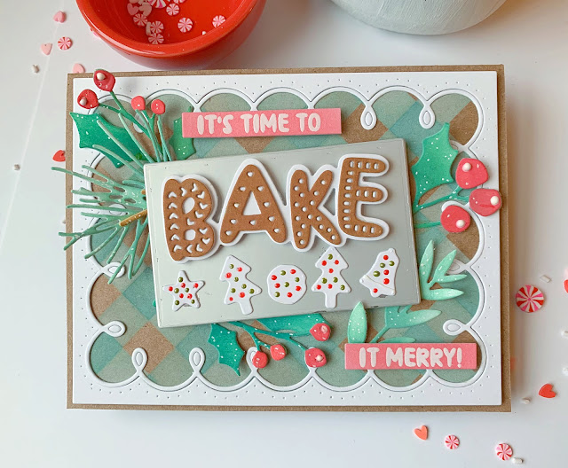
I am so happy to get a chance to play along with the Ass You See It Challenge this week! The theme is Christmas and I was inspired by their lovely photo…
I created a little baking scene with “Bake it Merry” from The Greetery!
I made a background with my favorite stencils called “Square Dance,” then added some Sizzix by Tim Holtz “Festive Gatherings” die cut greenery all around.
Come play along with this fun challenge! It always inspires me!
This week at the Color Throwdown, Wanda picked a really cool color scheme…dark green, yellow green, black, and white!
I chose to to use some primitive images with a modern twist with Sizzix dies by Tim Holtz called “Holiday Blocks.”
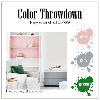
This week at the Color Throwdown Vickie chose some lovely fresh and modern colors…pink, green, and gray!
The beautiful fall colors from Lynn’s inspiration photo at the Color Throwdown Challenge took a turn …and somehow had me thinking about Christmas…yellow gold, red, brown, and kraft!
I used Tim Holtz’s Sizzix new “Santa Greetings Colorize” dies!
I made a woodgrain background with inked kraft paper, an old snowflake background embossed in white, paint streaks and splatters, and The Greetery’s “Herringbone Parquet” die.
Will your card reflect fall’s lingering beauty or give a sneak peek of the coming holidays?! Upload your creation at the Color Throwdown blog for a chance to be the randomly-selected guest designer at an upcoming challenge!
Thanks for stopping by!
This week at the Color Throwdown, Lori gave us some lovely colors to wrk with…green, rust, pink and yellow!
I recently learned about a fun card design called a “spanner.” It’s like a 3-layer card made from an A2 size. I added all kinds of products from The Greetery including “All Wrapped Up”…
I also used the “Tartan Plaid Diagonal” stencils, a polka dot embossing folder, and retired “Polka Dot Basics” stamp set from Papertrey Ink!
Please join us at the Color Throwdown blog to play along for the chance to be the randomly-selected guest designer at an upcoming challenge! ❤️
Playing along this week at the Inspired By Challenge! Just look at this adorable Halloween decor…
Hahaha! I didn’t have ghost images or dies big enough for these spooky eyes, but the Papertrey Ink “Bright Night” set was perfect for making glowing lanterns! I embossed them with white powder on black cardstock so they would be ghostly! So if you run out of candles (or batteries) on Halloween night, capture a glowing-eyed monster or critter to light up the path as you Trick or Treat! 👻
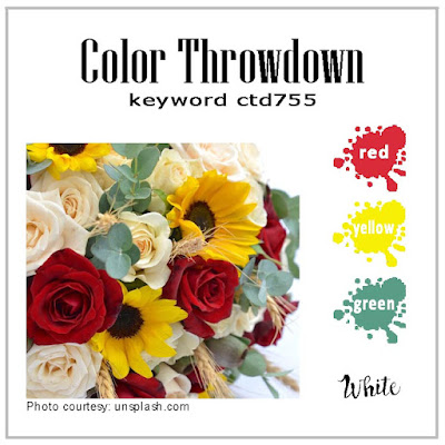
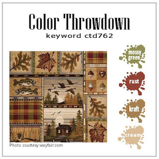
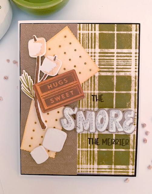
I’m up as the hostess this week at the Color Throwdown challenge blog! Some lovely rustic colors for you…mossy green, rust, kraft, and cream!
I chose a cozy cabin scene, inspired by the tiny cabin in the photo!
Upload your own creation with this fun color scheme at the Color Throwdown blog… we can’t wait to see what you make!
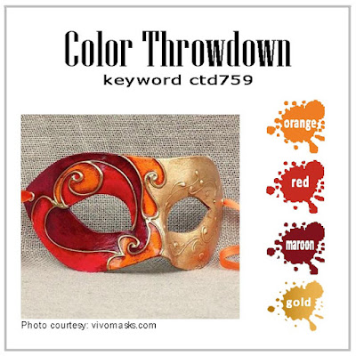
Such lovely fall colors from Vickie this week at the Color Throwdown blog…maroon, red, orange, and gold!
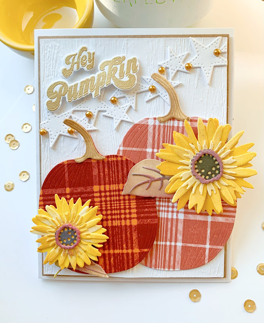
I had to use The Greetery’s new “Plump Pumpkins” dies!
Added “BotaniCuts: Sunflowers” colored with Tim Holtz Distress Oxide inks and Delicata Gold ink. The “Fall Foodie Sentiments” were embossed in gold, too. Couldn’t resist a wood background strung with the “Star Strip” die and some gold pearls. The plaid was stamped with a background from The Stamp Market.
We can’t wait to see what you do with these amazing autumn colors…helloooo fall! Upload your creation at the Color Throwdown blog this week!
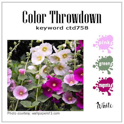
Some brights this week at the Color Throwdown this week…pink, magenta, green, and white!
I made a little embroidery-inspired get well card using products from The Greetery…
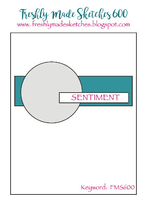
The talented designers at Freshly Made Sketches are celebrating their 600th sketch this week! Isn’t that amazing? 600 unique card layouts with tons of inspirational photos and gorgeous samples from the designers and players alike…provided every single week. What a place to visit when you need a creative boost!
This week’s sketch is such a versatile one…
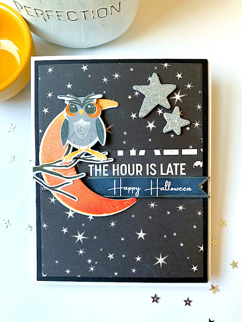
There’s a fall chill in the air here in NY, so I chose to get a little spooky…
I used vintage papers from October Afternoons’s “Witch Hazel” collection along with Papertrey Ink’s adorable “Happy Owl-o-ween” stamps and dies. So adorable and sure to bring a smile, not a spook! The “Happy Halloween “ sentiment is from PTI’s Haunted House” set. Lots of glittery paper and spray added all around, too!
Congratulations to the lovely designers at Freshly Made Sketches! Thank you for providing card makers with such wonderful inspiration and kind words every week. Cheers to 600 more ❤️!
This week at the Color Throwdown, Lori chose the sweetest inspiration photo (and coolest shelf ever!) for our color scheme…gray, green, and aqua!
Don’t ask me how I thought of a pencil?!
But, it will be perfect to send to my daughter who moved in at college today for the first time! I used Papertrey Ink’s vintage pencil shaker maker (haha), the “Notebook Backgrounder” (another vintage stamp, from Cornish Heritage Farms), and a sentiment from The Stamp Market!
Be sure to visit the Color Throwdown blog to see some more awesome samples, and to play along for a chance to be a randomly-selected guest designer for an upcoming challenge!
Lovely almost autumn colors at the Color Throwdown with Lisa this week!
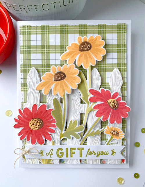
This week at the Color Throwdown , Susie is our hostess with a fresh and summery set of colors…red, yellow, green, and white!
I chose The Greetery’s “Oopsy Daisy” to plant around my Papertrey Ink “Picket Fence” die!
I embossed the fence with Stampin Up’s Woodgrain 3D embossing folder and added some Echo Park plaid paper for the background. The sentiment banner is made with The Greetery’s “Tear Strip Tags” coordinating sentiment and die set.
Be sure to visit the Color Throwdown blog to see more fun samples, and to upload your own creation! You could be the randomly-selected Guest Designer who will join us for an upcoming challenge!
I love the colors chosen by Amy Rohl for the Color Throwdown challenge this week…kraft, white, and green!
I decided that these colors would be perfect for a more masculine card, and used the amazing “Gone Fishing” stamps and dies from Stampin’ Up!
My Echo Park “Call of the Wild” 6X6 paper pad had some awesome fishing-themed papers, as well as colors perfect for this challenge. There is also one square embossed with Stampin Up’s “Twisted Rope” Stampin’ Cut & Emboss 3D folder…the texture is amazing. Shhh, I snuck about two inches of my husband’s fishing line that I found in a drawer! It must be “old” and unloved if it’s in the house (and not his tackle box), right?! 😂
Visit the Color Throwdown blog for more fun samples! Upload a creation of your own and you may be the randomly-selected Guest Designer at an upcoming challenge!
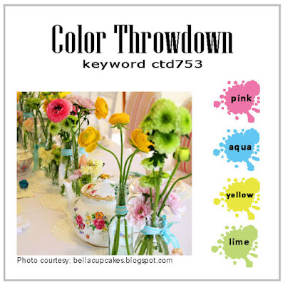
This week at the Color Throwdown challenge blog, Broni is our hostess with the sweetest mix of summer colors…pink, aqua, yellow, and lime!
I took these colors to the pool with Papertrey Ink’s “Floating By” stamps and dies!
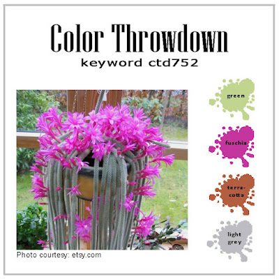
It’s my turn this week to host The Color Throwdown! A mix of brights and vintage reminiscent of a garden party…fuschia, green, gray, and terracotta!
I used The Greetery’s “Print Shop: Floral Frame” stamps, stencil, and dies for my card…
Visit the Color Throwdown blog to upload your creation…we can’t wait to see what you make!
This week at the Color Throwdown , Amy chose the most elegant color scheme EVER…aqua, kraft, gold, and cream!
I used The Greetery’s “Signed and Sealed” and “Signed and Sealed With a Kiss” for my card…
Used so many other products from The Greetery, including “Pretty Postmarks,” “Postal Frames” dies, “BotaniCuts: Forget-Me-Nots,” “Winter Medley” dies, and the “Cane Background” die, along with Stampin’ Up’s “Subtle 3D Embossing Folder.”
We can’t wait to see where this new color palette leads YOU…Join us at the Color Throwdown this week to upload your creation!
It’s the 750th challenge at the The Color Throwdown this week, how amazing! Wanda chose such lovely, light pastels…teal, gray, and pink!
I made a card with The Greetery’s “Greenhouse” die!At the Color Throwdown this week, we have some fun and bright colors from Vickie…pink, green, and purple!
I think I’ll call my creation a “modern botanical,” using products from The Greetery!
At the Color Throwdown Challenge on the first day of SUMMER (!), we have a beautiful, patriotic color scheme and inspiration photo from Lynn…red, white, blue, and brown!
I used The Greetery’s “BotaniCuts: Morning Glories” to make a rustic garden scene…
![]() |
This week at the Color Throwdown Challenge Blog, Lori chose a palette that is just perfect for summer (and anytime, really)! You can never go wrong with aqua, red, and yellow…
I made a shaped card using the sweet “Berry Basket” by Julie Ebersole from Ellen Hutson. You can use this die to make cards or 3D projects! The berries are cut with “BotaniCuts:: Strawberries” from The Greetery. I made my berry tops aqua, too, to stay consistent with the color scheme. I stamped Impression Obsession’s “Screen” Cover a Card background stamp on the berry basket. The sentiment is vintage Waltzingmouse Stamps :).