Thursday, January 31, 2019

12 Kits of Occasions with Jeanne Jachna


I was thrilled when Jeanne Jachna asked if I would like to be a guest at the The 12 Kits of Occasions this month! Of course, she sent the most AMAZING kit called "Good Fortune" with gorgeous papers, images, dies cuts, and embellishments inspired by Asian culture, architecture, food, and design!

Up first are the adorable ladies from Julie Ebersole's "So Matcha" set, available at Ellen Hutson.


I colored the ladies with Copics, then added some Wink of Stella accents and gems to their hair.


Also, some Glossy Accents to the teapot and Stickles to the fan. For the background, I used the lovely Chinese Landscape die cut and patterned paper from the PhotoPlay "Paper Crane" collection.


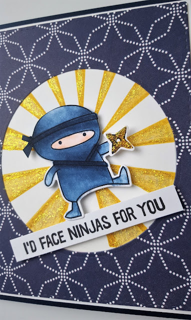
Next up, is a sweet, little guy from My Favorite Things "Ninja--mazing" set.


I colored him with Copics and added Papertrey Ink's Sunshine stencil in the background, coated in Stickles.


Loved how Little Ninja's Chinese star matched that PhotoPlay patterned paper!


My last card was created using a fun technique that Betsy Veldman posted on her blog this week called Watercolor & Salt Backgrounds.

I didn't know this lovely die was a moon (thought it was a tree scene!), but it ended up working perfectly for the sentiment from PTI's Guiding Light set that I had stamped! The die is from Hero Arts, and it's called "Cloudy Moon."


The background is made by coloring Kosher salt (I colored them with liquid watercolors), dropping the salt on a piece of watercolor paper that's already painted with watercolors (and still wet), then brushing it off when it's all dry. Fun texture and colored speckles are left behind!


I adhered sparkly gems to a Kaisercraft wood veneer lantern, and used gold thread to hang it from the clouds ๐Ÿ™‚!


This gorgeous thick, textured paper that Jeanne sent was perfect for this technique. This might be my favorite card of the set.

Thanks SO MUCH to Jeanne and the 12 Kits Design Team for letting me play along! Always inspired by this team of incredibly kind, generous, and talented ladies! ๐Ÿ’—


Sunday, January 27, 2019

Floating Throwdown

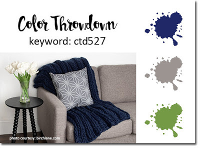
This week at the Color Throwdown are some fresh, stylish colors, navy, green, and gray...


Recently, Jennifer McGuire posted an awesome technique video on her blog called Floating Die Cut Frames and I couldn't wait to try it! Quick run down: you die cut images, cover a piece of cardstock with them, use press and seal wrap to hold them together on the base, die cut a frame from the center, peel off the cardstock base, add dimensionals on the backs of the pieces still on the press and seal, stick it on a card, then peel of the wrap...your frame remains, made with all the little stuck pieces ๐Ÿ˜ฎ!

Here is what mine looks like using PTI's Beautiful Berries:Winter...


Couldn't quite get these die cut pieces as close together as I wanted, so there are some gaps in my rectangle ๐Ÿ˜„ ! A rounder, less "spiky" die cut probably is better. Still a fun, magical look!


Added sequins in some of the openings, and a die cut Joy sentiment shaded with gray ink and Wink of Stella pen.


You HAVE to check out Jennifer's blog post, her floral cards with this technique are amazing! 
Thanks for stopping by!

Saturday, January 26, 2019

Pinkfresh Studio's January Challenge

Playing along with Pinkfresh Studio's January Challenge, which was to choose one of the 2018 challenges that you didn't get to last year.

With all of the lake effect snow we've been getting, (Translation...you drive along on a sunny, clear highway only to come upon a whiteout with three inches of snow piled on the road for 10 miles...then repeat!)...there was only one challenge to choose...SUMMER, the August Challenge!


I used Pinkfresh Studio's new Sweet Lemonade set paired with their equally sweet Fruitastic set...


The colors for August were pink, yellow, aqua, black, and gold foil, so I made my citrus flavor grapefruit! The polka-dotted background is the orange from Fruitastic stamped in yellow with some "rock-and-roll" pink highlights. The sentiment is also from the set.


Sponged the "Sweet Lemonade" bottle with pink and red Distress Inks, then added grapefruit slices from the set. The droplets were made with water splatter on the inks and Glossy Accents. I didn't have any gold foil, so I edged portions of the bottle with Diamond Stickles for "glassy" sparkle.


Stamped and die cut more slices and added them to the background. These fresh and fun images made me feel warmer already! ๐Ÿค— Thanks for stopping by!

Monday, January 21, 2019

Lemonade Sketch

I recently received Pinkfresh Studio's new Sweet Lemonade stamps and dies in the mail and couldn't wait to use them for some challenges!

First, for Freshly Made Sketches this week...


...and also Simon Says Stamp Monday Challenge. This week's theme was alcohol, inks and drinks :). Since I used Sweet Lemonade (maybe with a little something extra if it's a vacation style lemonade๐Ÿ˜‹) and a few Copic markers on the bottle, I thought this would fit!


For the rounded square portion of the sketch, I sponged a mix of light-colored Distress inks and spritzed the paper with water, then stamped some bubbles from the set.


Added lots of fruits and a small strip of yellow gingham paper for the center, with a sentiment from the set stamped underneath.


Lots of Nuvo Drop bubbles in coordinating colors, and a little bit of sunshine (on this negative 20 wind chill day!) is finished! Thanks for stopping by!


Sunday, January 20, 2019

Tumbling Mittens Throwdown

Fourteen inches of snow, a long weekend, and cool colors made it all about a wintery card for this week's Color Throwdown...


Blue, aqua, and white are this week's colors, so I chose to use PTI's Warm & Fuzzy set for this winter card...


Die cut and stamped the mittens from Warm & Fuzzy, then embellished them with white Nuvo Drops.


The sentiment from WMS' Alpine Christmas is stamped in AMuse Studio's Cobalt ink, and heat embossed with Detail Clear powder.  Added some blue and white baker's twine on a square frame cut with Nestabilities.


I darkened this picture a bit so you could see the beautiful knit background stamp from Ink Blot Shop that I stamped in aqua. It's so perfect to add to cozy winter cards ๐Ÿ˜Š! Thanks for stopping by!

Tuesday, January 8, 2019

Inspired by Winter Watercolor

This week's Make it Monday video at Papertrey Ink was created by Ashley Cannon Newell and it's entitled Winter Watercolor. It's an awesome video that inspires you to try your hand at watercoloring and stamping a winter scene...she made it look so easy and fun!

Here is my card, using most of the same sets as Ashley, and her positioning of stamped trees as my guide...


Used many Tim Holtz Distress Inks in blue, green, and gray, along with watercolor brushes in different sizes. The stamp sets are Enchanted Forest, trees from Winter Village, and a sentiment from O'Tannenbaum.


 I didn't have gesso, so I used white gouache mixed with water. So much fun!

Sunday, January 6, 2019

Blessings

Playing along with two challenges today, The Color Throwdown had some lovely sunshine colors this week...yellow, green, white, and black...


The Simon Says Stamp Wednesday Challenge was to use something new...so I chose this beautiful Folk Dance die that I ordered from Simon Says Stamp over the school break :)


I needed a wedding card for the weekend, and used yellow and green patterned paper for my leaves and flowers.  The sentiment was created with Concord & 9th's Sophisticated Script set and asmaller sentiment from WPlus9, heat-embossed in white on vellum.


I had used black cardstock for the flower centers and dots, but I wanted a bit of shine... so I (crazily) used black Nuvo Drops instead of Glossy Accents over the black paper! Of course every little mistake showed up 10 fold on the white. I added the vellum to cover a small smear ๐Ÿ˜ฃ.


But I'm sure the happy couple won't peek underneath, so all is well that ends well! ๐Ÿ˜ƒ

Saturday, January 5, 2019

PTI Make it Monday... 2018 a la carte

This week's Papertrey Ink's Make it Monday is their yearly a la carte post, when they feature all of the MIMs from the year, and you choose a technique that you didn't get a chance to try. I chose Stephanie Gold's MIM #331: Creating Mixed Background Texture.

I used Floral Fantasy: Christmas stamps and dies, and the Hexagon Cover Plate to create my card.


Stamped leaves from the set in three shades of grey at the top, then added some Nuvo Drops, and the bottom hexagon piece.


Embossed the deer in white on white cardstock, then sponged Wilted Violet and Hickory Smoke Distress Inks over the top. Added a sentiment and grey, violet, and hot pink flowers and branches from the set, with some tiny clear sequins, over the tag. A bit of twine in a bow and finished! 

Love the light airy feel of Stephanie's designs!