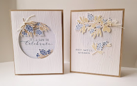
I stamped the berries in a darker shade of blue so that the navy details weren't such a stark contrast...plus they look more authentic now (because nobody wants to eat pale blue blueberries :)). I also darkened the kraft colors on the leaves.
I kept the big berries at the top but had them peeking through the top of the circle instead of just slapped on, hee! Kept the Woodgrain top layer, but changed the sentiment. The first sentiment placement was weird, too small, and did not mirror the elegance of the berries. Betsy included this lovely sentiment in the Beautiful Berries set, so I decided, the designer knows best!
I am so much happier with the end result! This was such a fun challenge that really made me think!


Great 'remake'! There are so many cards I've made that need transforming, Jo x
ReplyDeleteA gorgeous re-make!
ReplyDeleteNice analysis of weak points with a beautiful result! Something about a frame that adds pizzazz to objects.
ReplyDeleteBoth cards are so pretty Kelly! Love how you showcased the beautiful berries!
ReplyDeleteThey are both pretty,Kelly but I would agree I would want to eat darker blueberries, lol! I do like the transformation with the circle!
ReplyDelete