I am playing along with my first
"Transformation Tuesday" Challenge at Papertrey Ink! This week, Lexi Daly showed an example of transforming an "old" card that she wasn't quite happy with, into something new and spectacular!
I remembered this card right away from last March, 2017. I
really disliked the end result, especially the layout with the big berries "floating" at the top. Also,it looked so "pale" and flat! I really loved the elements of the card, yet I couldn't make it all work out...so I just said,"Time to be done!" and posted it.
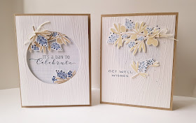
For my new card, I focused on brightening up the blueberries, adding dimension, and having a better "grounded" end product!
I stamped the berries in a darker shade of blue so that the navy details weren't such a stark contrast...plus they look more authentic now (because nobody wants to eat pale blue blueberries :)). I also darkened the kraft colors on the leaves.
I kept the big berries at the top but had them peeking through the top of the circle instead of just slapped on, hee! Kept the Woodgrain top layer, but changed the sentiment. The first sentiment placement was weird, too small, and did not mirror the elegance of the berries. Betsy included this lovely sentiment in the Beautiful Berries set, so I decided, the designer knows best!
I am so much happier with the end result! This was such a fun challenge that really made me think!


